Creates a horizontal bar chart showing the average permutation importance of each predictor, measured as the change in net benefit relative to the full set of evaluated models.
Arguments
- all_models
Data frame returned in the
all_modelselement ofnb_varsel(). Must includeVIF_columns generated whenpermutation = TRUE.- filter
Integer or
NULL. If specified, only the topfiltermodels byAvg_Net_Benefitare used to compute average importance. Defaults toNULL, which uses all models.- color
Character string. Fill color for the bars. Defaults to
"#2A6EBB".- data_dict
A named character vector used to relabel predictors. Format:
c("raw_name" = "Display Label"). Defaults toNULL.
Value
A list with two elements:
- plot
A ggplot2::ggplot object showing the bar chart.
- data
A data frame containing the
Variable,Average_Delta_NB, and mappedLabelvalues.
Examples
data(adnex_results)
vif_results <- VIF_plot(adnex_results)
vif_results$plot
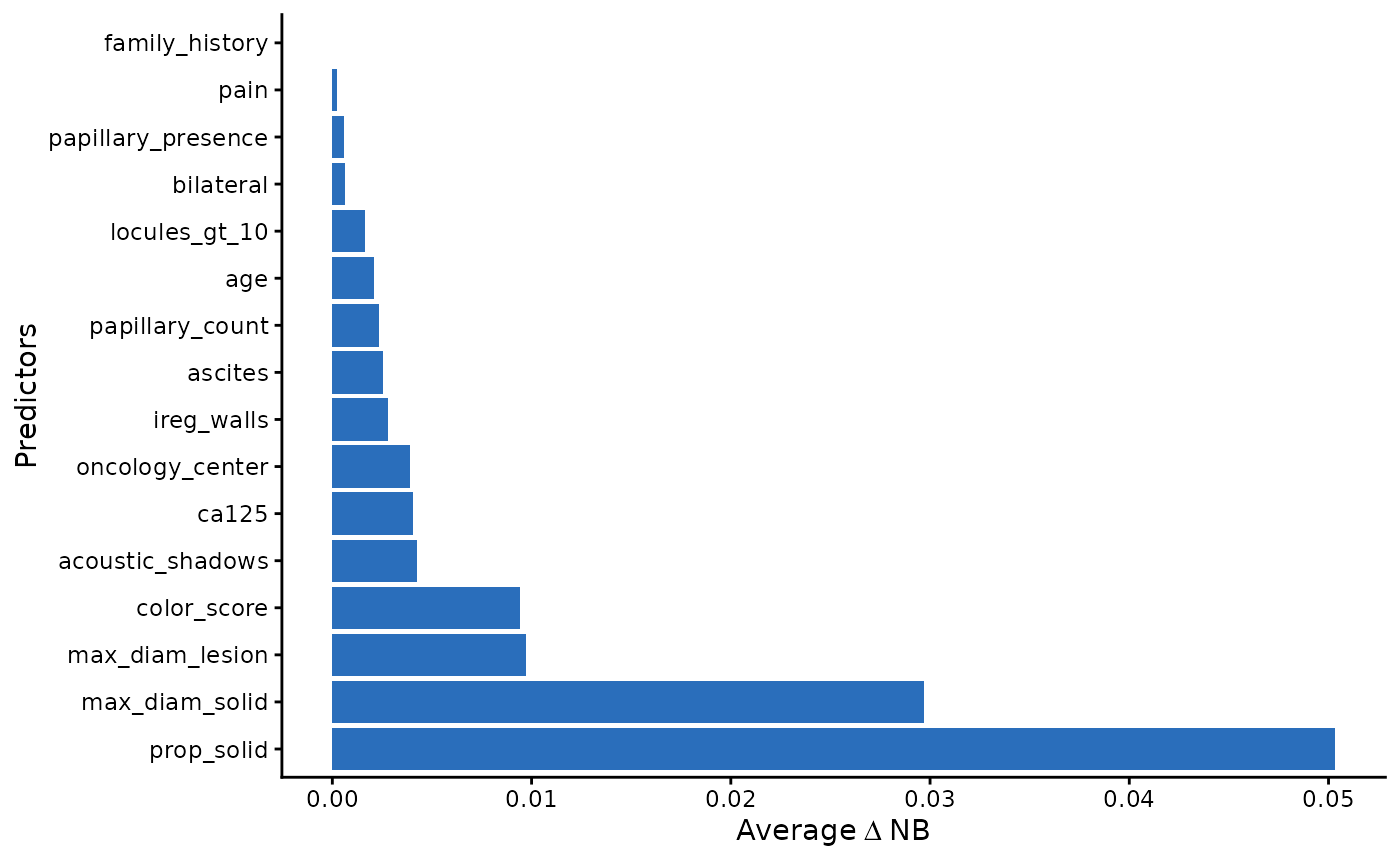 head(vif_results$data)
#> Variable Average_Delta_NB Label
#> 1 prop_solid 0.050336541 prop_solid
#> 2 max_diam_solid 0.029713935 max_diam_solid
#> 3 max_diam_lesion 0.009729310 max_diam_lesion
#> 4 color_score 0.009400117 color_score
#> 5 acoustic_shadows 0.004271808 acoustic_shadows
#> 6 ca125 0.004059608 ca125
head(vif_results$data)
#> Variable Average_Delta_NB Label
#> 1 prop_solid 0.050336541 prop_solid
#> 2 max_diam_solid 0.029713935 max_diam_solid
#> 3 max_diam_lesion 0.009729310 max_diam_lesion
#> 4 color_score 0.009400117 color_score
#> 5 acoustic_shadows 0.004271808 acoustic_shadows
#> 6 ca125 0.004059608 ca125